In parts 1 and 2 of this 3-part email series on How to Drive Opens, Conversions, and Revenue, we’ve discussed core email strategies like email automation, triggered campaigns, welcome series, abandoned cart, and numerous other ways to design and send out emails.
In the third and final blog post on driving email revenue, we’ll discuss email acquisition, testing, call to actions, mobile subject lines, and optimizing for desktop, mobile, and tablet.
Modal Acquisition – Are They Annoying Conversion Killers or Revenue Superstars?
You always hear that people hate these things. You know, that lightbox that pops up a few seconds after you hit a homepage and asks you to subscribe to a newsletter. And granted, sometimes they are annoying. But these often convert at a conversion of 30%. So 1 in 3 will subscribe to your newsletter. That’s an incredibly easy way to build your list. When Bentley Leathers re-launched its website, we launched week 1 without modal, and got very little boost in the way of new subscribers. We launched modal in the week that followed, and subscribers skyrocketed.
And if you have long email signup forms, ask yourself “is this additional information worth losing subscriptions? Is it worth losing sales?” Select the essential data you need for your email subscribers, and then build out a preference center where your subscribers can tell you more about them, or about their preferences as it relates to frequency of email, category interest, gender, etc.
Test Or Be Eaten
When it comes to email testing, start small, and go large. It’s easy to sit at your desk and be happy just sending out an email to your database, and then watch and report figures coming in. If the email analytics you present to your executive team or board don’t contain test results, then your simply not trying hard enough.
The first thing you need to do is figure out “what” you want to test. What are you trying to learn from your subscribers? It can range from figuring out the time they like to receive the email, day of email, weekend vs weekday, subject line, or design characteristics like length of email, call to action placements or colour, etc. You can even test if content or campaign emails perform better or worse than product-specific emails.
The second important element to ask when it comes to testing is “why?” There are various testing methodologies out there, so I won’t highlight them here, but when you choose the reason why, make sure you look at other metrics as well. So if your goal was to increase your open rates, don’t forget to look at CTR, conversion rates, and revenue per email. Just because you test to improve open rates, it doesn’t mean some other metrics won’t get affected. But you do need a goal or hypothesis for testing to be effective. If you don’t have a goal in mind, your tests are likely to fail, since you don’t know why you are testing. (For more information on various testing methodologies, see the following: Conversion XL, Optimizely, and my personal favourite, Wider Funnel Marketing).
Testing: Start Small, and Go Large
And don’t get lost either, especially if you have a small team. Don’t get overwhelmed by the fact that you can test everything and anything. You can even test the location of the privacy policy on your footer. But when you have a small team, focus on the tests that will have the greatest (or quickest) impact on your top line sales or get you the most leads. Remember the Pareto Principle, or the 80/20 rule, when it comes to testing: test the 20% that makes 80% of the difference.
When it Comes to Testing, What is Statistically Significant?
Sometimes, tests are inconclusive, or simply not statistically significant. If you get results where the open rates or the revenue after or during a test are almost identical, but you expected a bigger delta between the two, I would test again. And if you get a similar result, i.e. a tie, then I would change it up significantly. Maybe you tested Saturday vs Sunday. Well, then try testing Monday sends vs Saturday sends. Maybe you tested blue vs green button. Try testing the placement of the button rather than the button colour. Try testing various call to actions. The point is if results are too similar during a test, it means you’re likely not changing enough of the element(s), or changing them too slightly.
And what is statistically significant for you? Well that depends on your business. But whether we’re talking about participants or visitors (in this case your email sends or traffic) or the results, make sure to use common sense. So for example, if you only get 100 visitors a day to your site or you have a list size that is under 5,000 subscribers, then the length of your test will have to be longer. If you run your email test, and the open rate for test B is 0.5% better than test A, like I mentioned above, you may want to test another element, as that is not a large increase in open rate %. However, if your conversion rate increases by 0.5%, then that is a solid test and you have your winner.
Call to Actions That Drive Results
Web usability expert Steve Krug adequately said it: “Don’t make me think!” When it comes to call-to-actions (CTA), don’t make me think should be the anthem. We all love talking about CTAs. But when we talk about CTAs it is usually in reference to a homepage or landing page. But just like an email needs a purpose, so does a call-to-action in an email. Sure, the purpose is to get subscribers where you want. But, by asking yourself the following three questions, you can get beyond the superficial and figure out the real purpose behind your call-to-actions. There are 3 factors to consider:
- What do I want a subscriber to do?
- How will they know what to do?
- Why should they do it?
So think about call to actions on your email too. It’s not just about your website. Every call-to-action should provide some value for the reader. Whether or not it is explicitly stated, it should be clear to the subscriber exactly what they get for investing their time in your email and landing page. Do you want them to shop, browse, compare, answer a survey, refer a friend, or subscribe to a newsletter, among many other possible CTAs. These questions help to clarify that value and, once answered, you can start thinking about how best to convey that value proposition in a call-to-action.
Win at Mobile With Twitter-like Subject Lines
What is most likely to cause you to open and read an email from a brand? Or even a friend?
Subject lines are the first thing the recipient sees and it determines whether or not the email gets opened, so the importance of the subject line can’t be overstated. But there must be thousands of blogs on subject lines, so I won’t bore you on the subject. The main thing to remember? Be different. Be fun.
But when it comes to mobile, there’s something else you need to remember. Be short. Or at least write the important part of your subject line first.
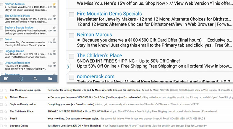
Different mobile devices show a different amount of characters, and the character count on each device will also differ depending on how the user holds it. The iPhone 5, for example, will only show about 35-38 characters in portrait mode but 80 in landscape mode. The Galaxy S4 shows slightly fewer characters – about 33 in portrait mode and 72 in landscape. An iPad will show 39 characters regardless of the orientation while the iPhone 6+ shows up to 63. Here’s a graphic from Listrak on how the same Gmail inbox looks in both portrait and landscape, along with the desktop view for comparison:

So how do shorter subject lines perform? Subject lines with less than 10 characters had an open rate of 58% in 2014, according to a study by Epsilon. Knowing that, try to avoid subject lines that are too long – or at least put the most enticing part of the message first. Keeping subject lines to 35 characters is tough but you should definitely try to do just that; or, at least keep your main message to 5 or 6 words and put it at the very beginning so it shows up on a mobile device no matter how a reader is viewing it.
And just a word about short subject lines, and how powerful they can be. A few years ago, while I was working for Mexx, we had one of our best boys collections I can remember. They were adorable outfits, from mini suits, to fitted jeans, to skull t-shirts. And one of our copywriters, a young girl who had no dreams of getting pregnant any time soon, came up with an awesome subject line: It’s a boy! We all thought it was cute and fit the campaign, and when we hit send, we thought nothing of it.
Well, did we get inundated with calls, many of them angry. Some were upset that we had somehow got hospital records, because they were indeed having a boy in a few weeks. Some wondered how we knew they were pregnant. Some were upset, because they were having a girl, and thought their husbands would freak if they saw the email. Others thought it was brilliant remarketing, except it wasn’t. It was simply plain luck. We thought the email would be cute. We thought it would be fun. And I can assure you we had no access to hospital or personal records. But the attention showed us something. Be bold. Be different. It’s ok. That email in particular netted us our highest ever open rate for a boys collection email, at over 50%.
How Pre-Headers Can Easily Help Drive Opens
It is also important to note that the email pre-header text, which shows up under the subject line on most devices, is a huge element in email open success, especially as it relates to mobile. So be sure that pre-headers reinforce the subject line and main message.
Pre-header text is a bit of a wildcard that seems to be misunderstood and misused, but can be every bit as useful as a subject line. In fact, by default, iPhones show between 70 and 80 characters for a pre-header, and can be increased to add more lines in phone settings. With more room to work with, why aren’t more marketers taking advantage of this? Often times, it’s simply because they don’t know about it.
How to Leverage Pre-Header Text and What to Avoid
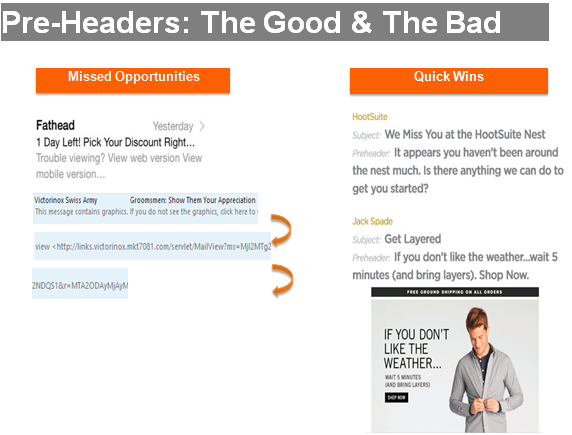
What to avoid: A pre-header that reads “Can’t see images? Click here to view in browser” does not offer any helpful information about what might be found in the email. But how often do you still see that line in your inbox? Far too often! It’s a wasted opportunity to nudge the subscriber into opening your message.
The life span of a subject line and pre-header are measurable by one statistic, open rate. Subscribers only spend about 3-4 seconds reading the description of your email in an inbox. We need to grab their attention and interest immediately. The pre-header should support the subject line and summarize what content can be found in the message. Here are a few good and bad examples.

Especially as we go to shorter and shorter subject lines, the pre-header is where you can expand upon your message.
Mobile is Not Coming. Mobile is Here.
Years ago, marketers, agencies, and the companies that hired them would say that mobile was coming and that we needed to be prepared. Well, mobile is not coming anymore. Mobile is here, now, and we have to change the experience, not simply alter it.
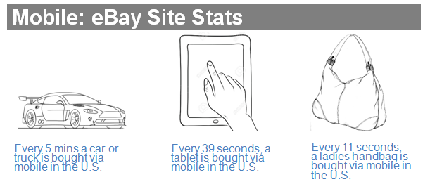
According to eBay, every 5 minutes, a car or truck is bought via a mobile device on eBay in the U.S; every 39 seconds, a tablet is bought via mobile on eBay in the U.S.; and every 11 seconds, a ladies handbag is bought via mobile on eBay in the U.S. So that means your wife or girlfriend may have just bought a handbag while you read this sentence. But all kidding aside, these eBay stats put into perspective that mobile is here and people are shopping on mobile. And again, these stats are for the eBay site, not Ecommerce in general. Those are mind blowing numbers.
And I think we are all sold on our websites being mobile and tablet responsive. But what about our emails? Do we design and test them to be responsive? According to Litmus, 51% of all emails are now opened on a mobile device. Now for the bad news.
70% of consumers delete emails that do not render well on a mobile device. Furthermore, 18% will actually unsubscribe when they receive a mobile email that doesn’t look good on their device.
So think about how your copy and design render on mobile and tablet. Responsive emails have a 113% higher click-through rate on mobile devices than non-responsive messages. More importantly, I’ve seen mobile sales jump an incredible 2,700% after implementing responsive designed emails even though the site wasn’t responsive yet. This proves that you don’t have to wait until your site is responsive before you implement mobile-optimized email messages.
On a side note, Litmus is a great tool that helps you understand how your email renders on several devices. I recommend you take a look at it. Check it out: Litmus tool.

Helpful Tips to Help You Navigate Mobile Emails
If you’re just getting started with responsive emails, here are some best practices to consider:
- When designing, think of the content as a grid – this will help you be able to quickly and easily stack the content in the right order.
- Remember – recipients will scroll – long messages are okay, especially on mobile devices. Your readers are used to scrolling through long Facebook, Twitter, and LinkedIn feeds, so it’s okay to scroll through long email messages as well.
- Watch font size – if you have text in the hero image, think about how small it will appear on a mobile device. If it isn’t easy to read, remove the text from the image so the mobile message will be clear enough to read.
- Design for thumbs – buttons should be large enough and have enough padding around them for fingers and thumbs to easily use. One-third of all mobile click-throughs are made by accident, but well-thought out designs will greatly reduce this issue.
- Position navigation appropriately – think about what your main message is and try stacking the navigation at the bottom of the message. Remember, recipients will scroll to the bottom so it will be seen, it just won’t be the first thing that shoppers or readers see when they open your message.
And that concludes the 3-part series on Email Commerce: How to Drive Opens, Conversions, and Revenue. I would love to hear your feedback on part 3, or on this series in general.
If you’d like to check out the first 2 parts of the series, they are below:
Series 1 in the series will outline potential welcome and cart abandonment email strategies.
Series 2 in the series will take a look at some more triggered campaigns that convert and drive revenue.


Leave a Reply